Introduction
The redesign project for the Almaty Metro was conceived and developed to provide a more comfortable navigation experience in the metro for residents and visitors of the city. In this work, I have aimed to describe all the issues with the current navigation system and propose methods to address them.
1. Logo

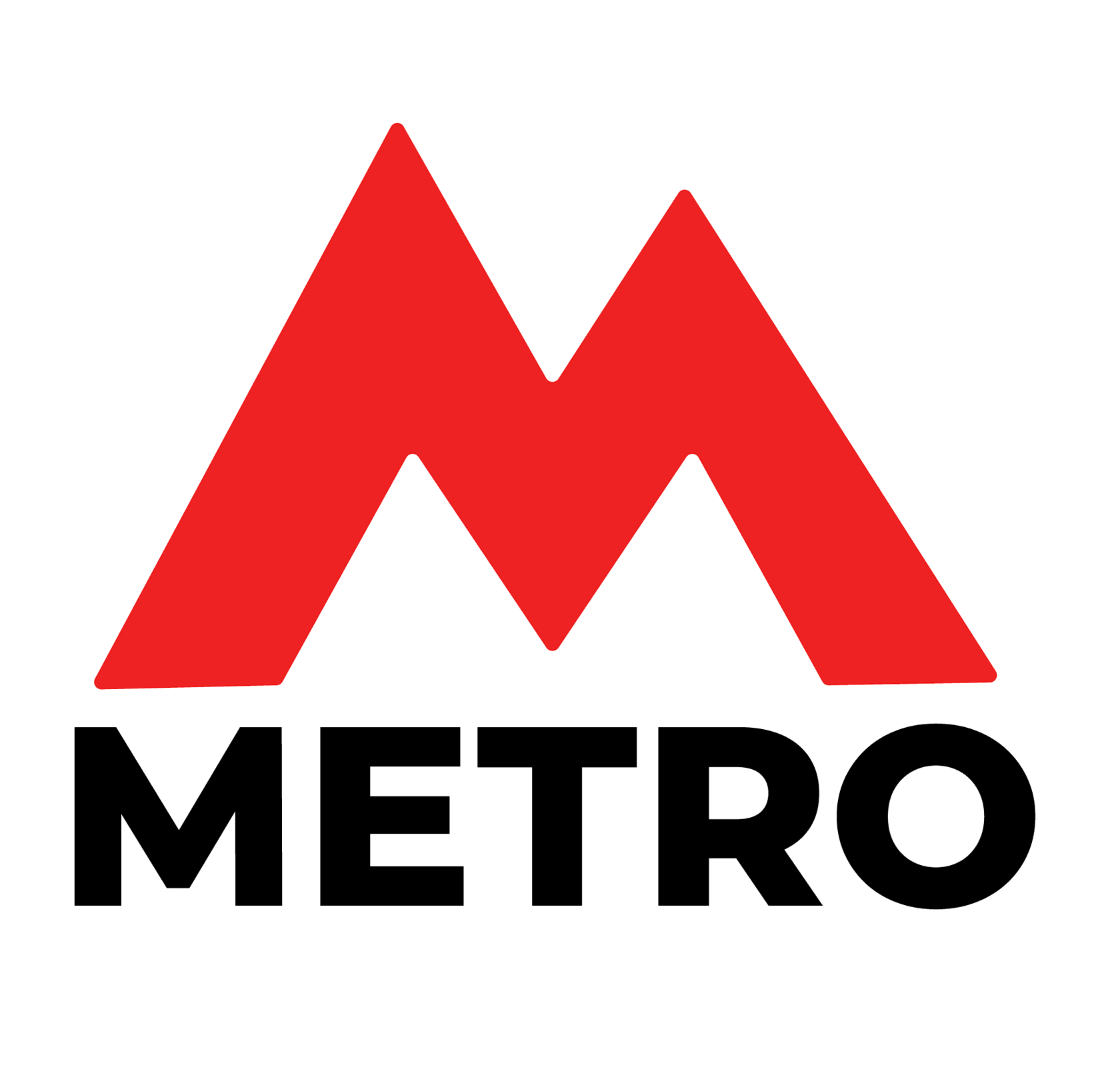
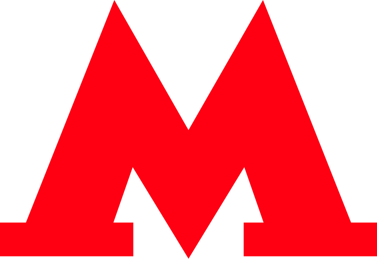
The symbol of a red letter "M" is no longer original. A similar emblem is used by the metros in Moscow, Nizhny Novgorod, Novosibirsk, and many other cities.


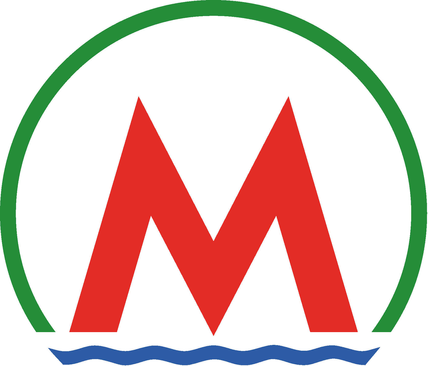
After creating numerous mockups, including endless variations on the theme of the red "M," I arrived at the final design
This solution helps reinforce in passengers' minds the idea of various transport systems as a unified network.
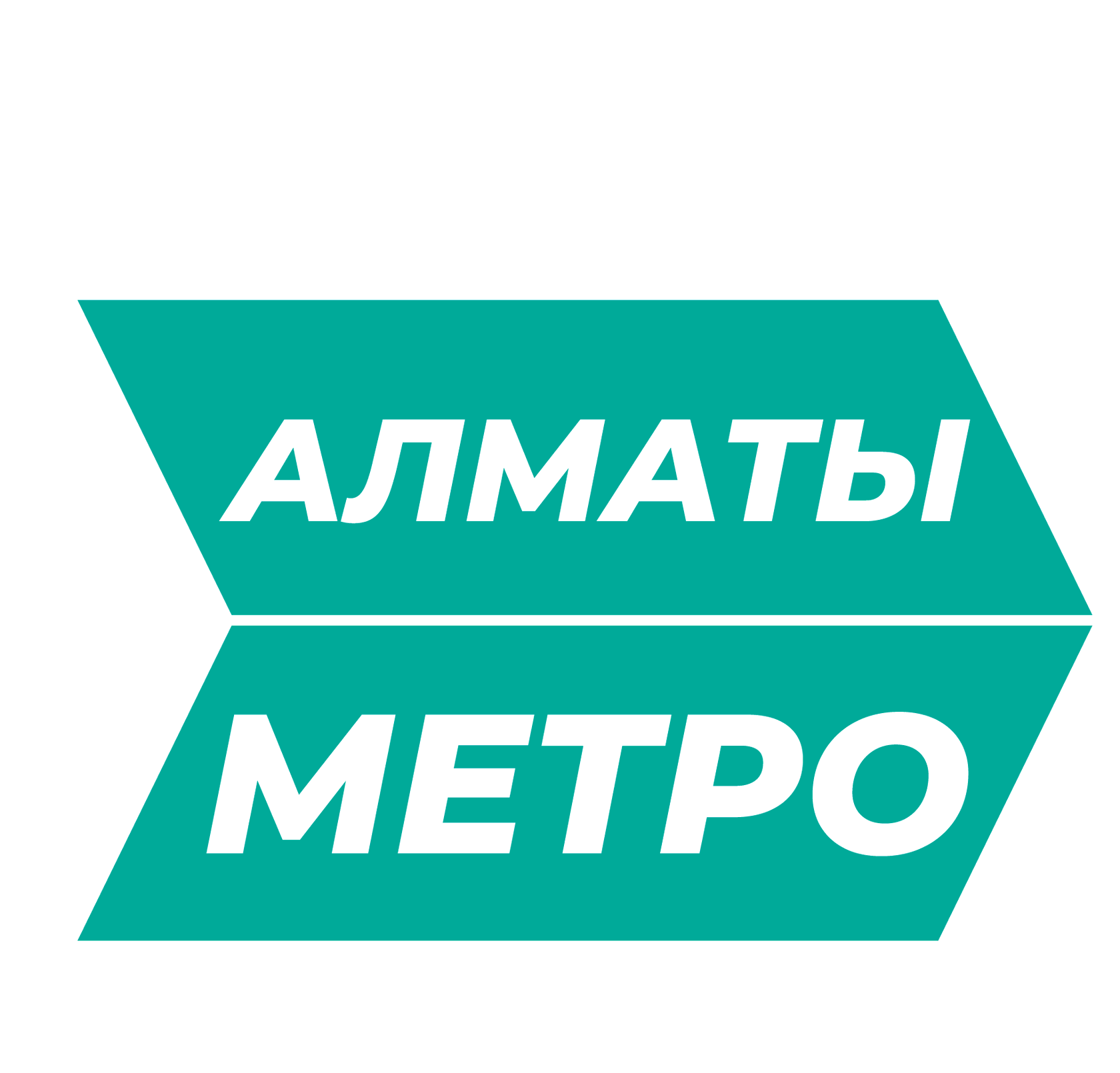
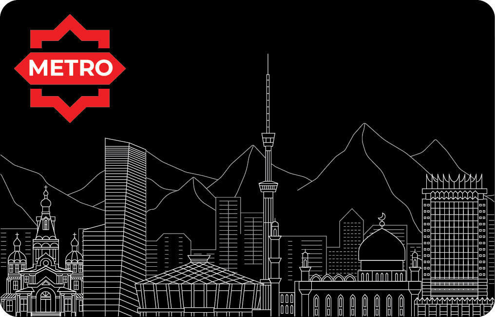
Let's start with the essential "face" of any brand — the logo.
There are no radical criticisms of the current metro logo. It fulfills its primary function: indicating the presence of a metro station. Its issue is that it appears somewhat outdated and lacks a modern visual language.
There are no radical criticisms of the current metro logo. It fulfills its primary function: indicating the presence of a metro station. Its issue is that it appears somewhat outdated and lacks a modern visual language.
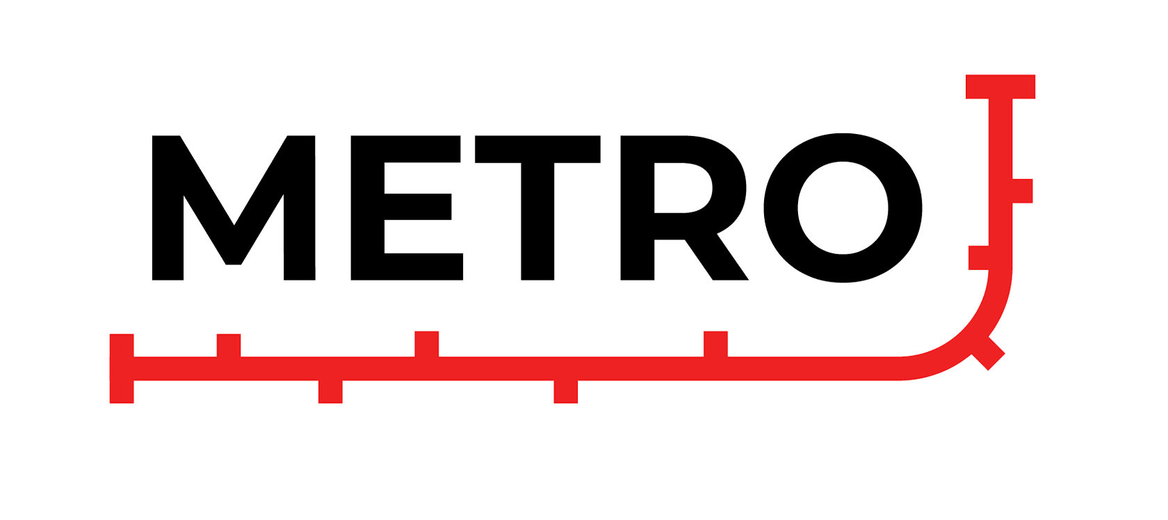
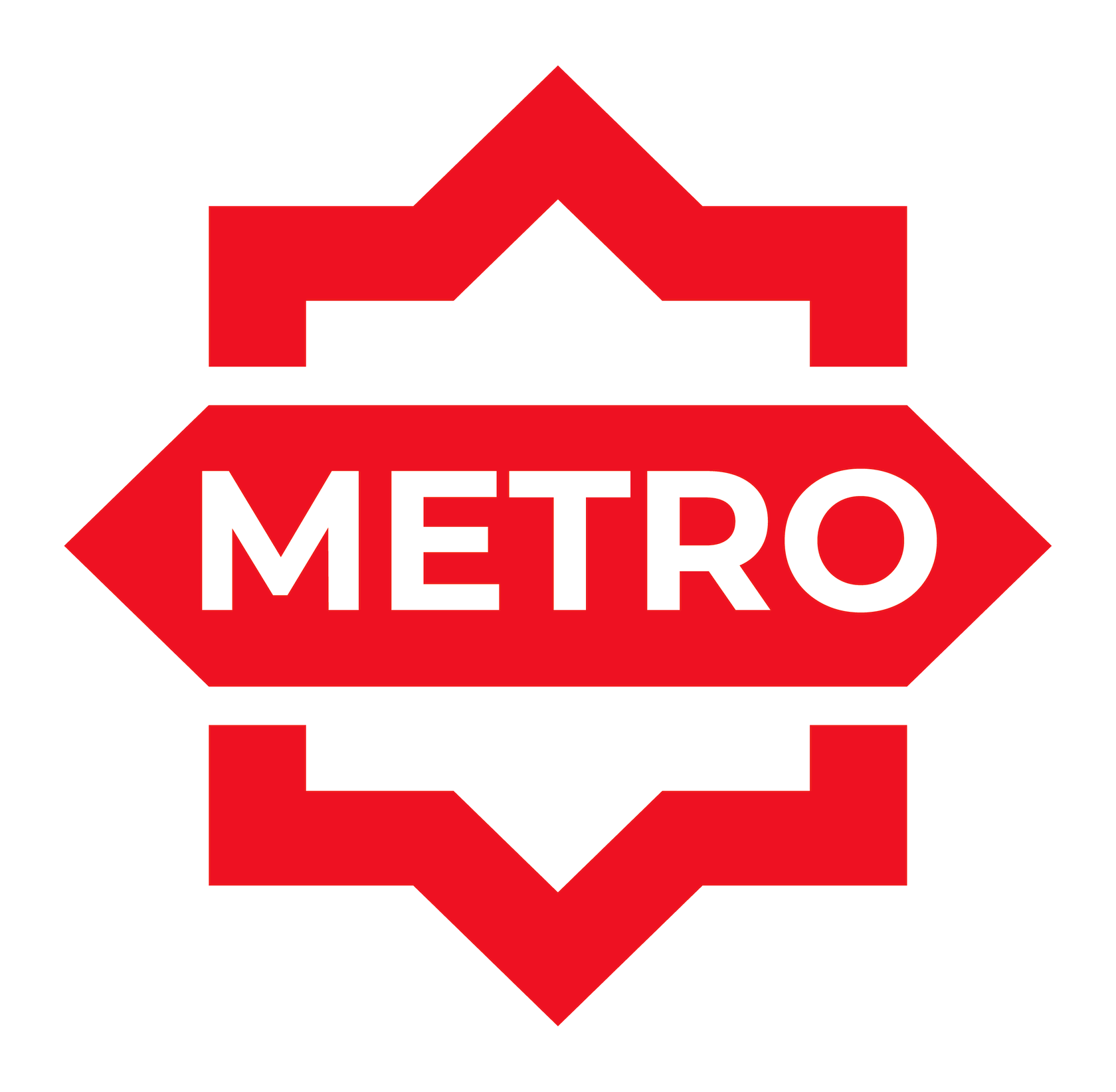
The new logo should be:
- Modern.
- Clearly denote its association with the metro.
- Universally understandable.
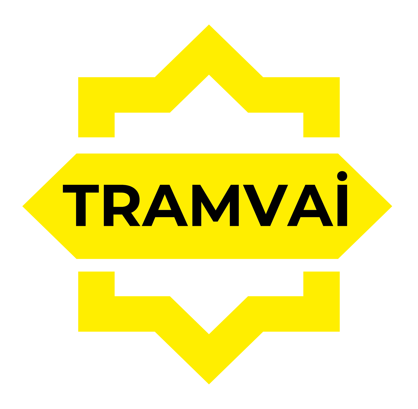

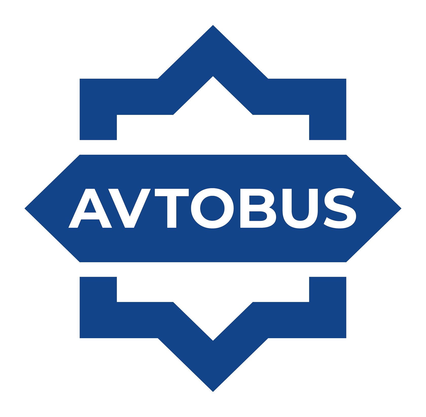
The new logo is universal. It can also be conveniently adapted for other types of public transport:
The new logo is a variation on an eight-pointed star, a nod to culture of Central Asia.
The primary color remains red, as it is the color many associate with a metro system. It also references the first (and so far, only) constructed "red line." The central inscription uses the Latin script "METRO." The decision to use this alphabet was made because Kazakhstan is in the process of transitioning to the Latin script. This highlights the modern and relevant nature of the new design while reflecting the country's language policy direction.
Furthermore, the Latin spelling “METRO” makes the logo globally recognizable. The Cyrillic spelling “МЕТРО” is problematic for international visitors because the Cyrillic letter “Р” is actually the sound “R” — so to most foreigners, the word would be incorrectly read as “METPO,” which is meaningless
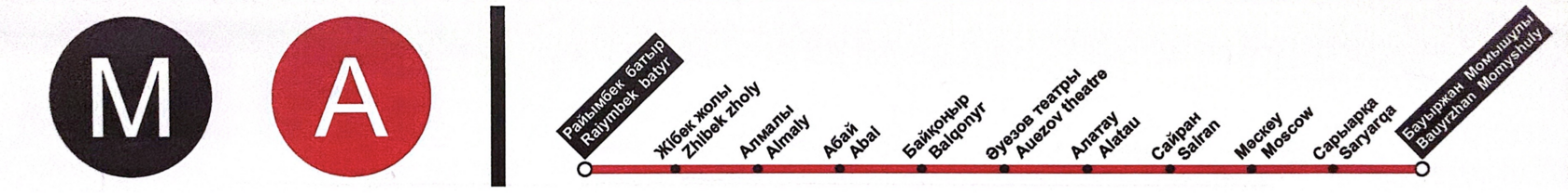
2. Line A
Let's move on to the metro line itself. The first constructed line currently bears the designation "M"A"
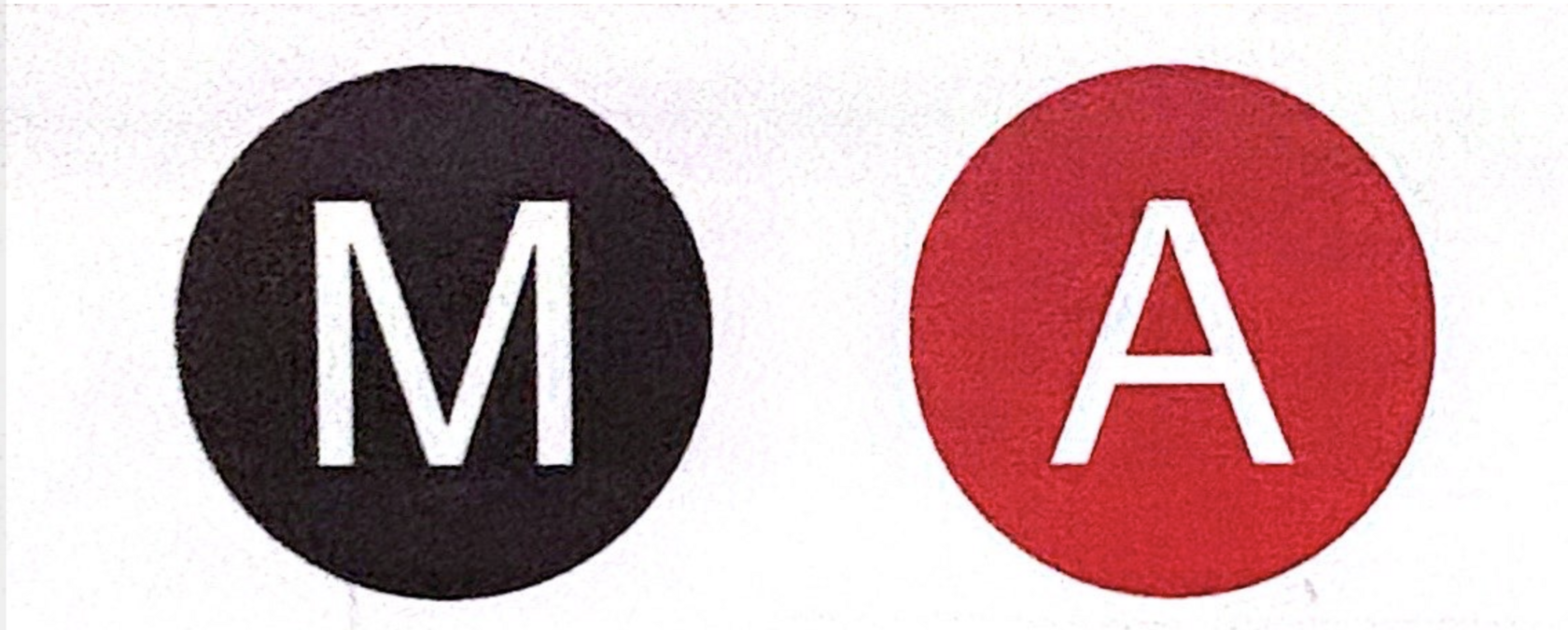
First, let's address the letter "M". Intuitively, one might think it stands for "Metro," but why is it necessary? Anyone entering a metro station already knows what kind of transport system they're in, it doesn't need a label distinguishing it from a train station or bus stop. Such a designation makes sense at major Public Transport Interchange (PTI), where urban trains, metro, and commuter rail converge at a single station. However, even considering the future development plans of the Almaty Metro, no such large-scale hubs are currently planned. Therefore, the letter "M" is entirely superfluous here so we can remove it to lessen visual noise.
The situation with the letter "A" is more complex. Its function is to label the line. In the future, lines "Б," "В," and so on, are expected to appear. Or are they?
With only one line currently in operation, it's impossible to know which alphabet planners are using. If it's based on the Cyrillic Kazakh alphabet, then the next line should logically be “Ә.” While there's nothing inherently wrong with this letter, such a designation complicates navigation for tourists unfamiliar with its unique look and pronunciation.
Even if we avoid unique letters, the problem persists. One might think using plain Latin letters without special characters is the solution, but this creates confusion for local residents. For example, the Cyrillic letter "B" could is pronounced as "B" (English) or as "V" (local pronunciation), resulting in one line having two different names.
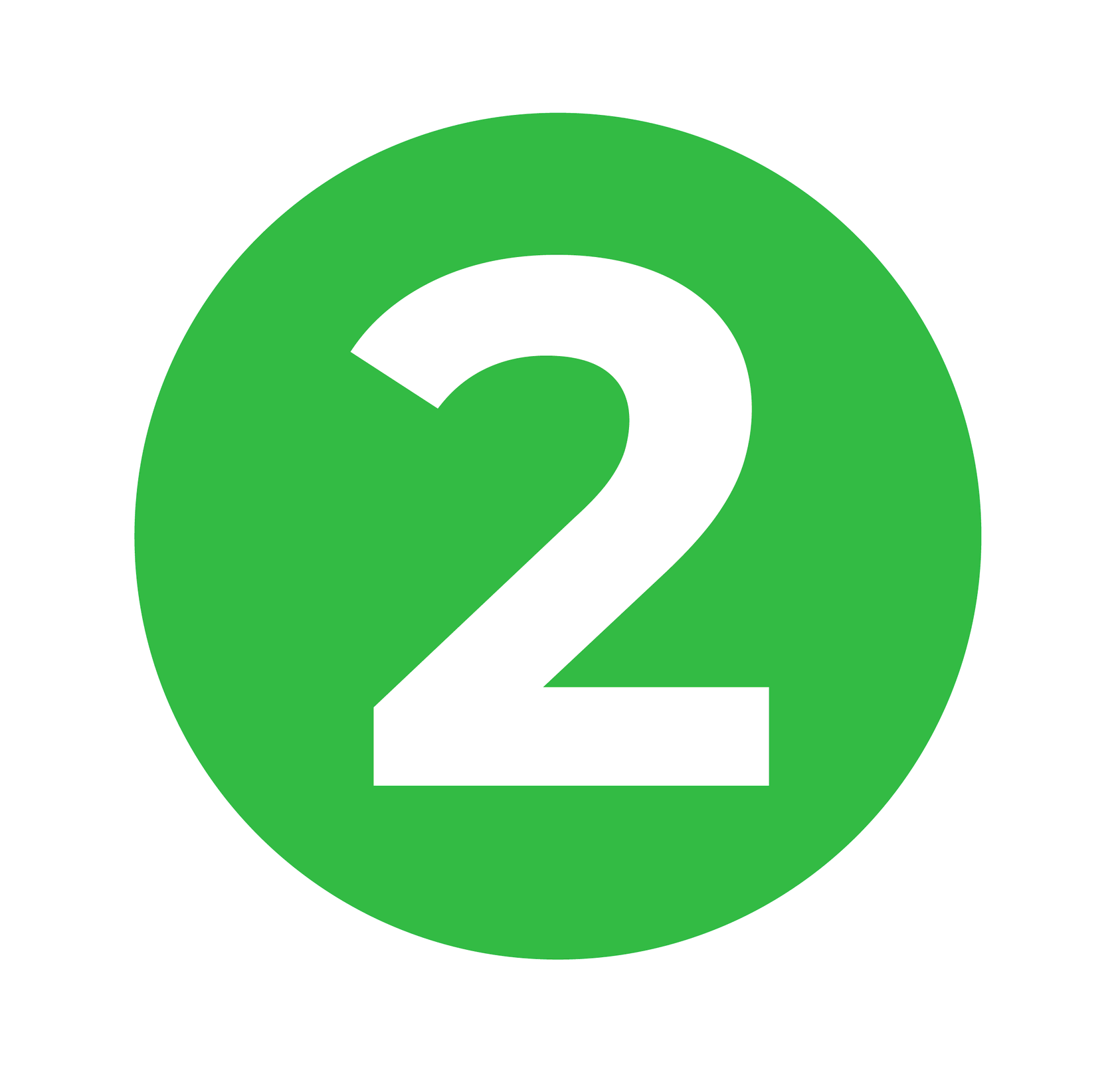
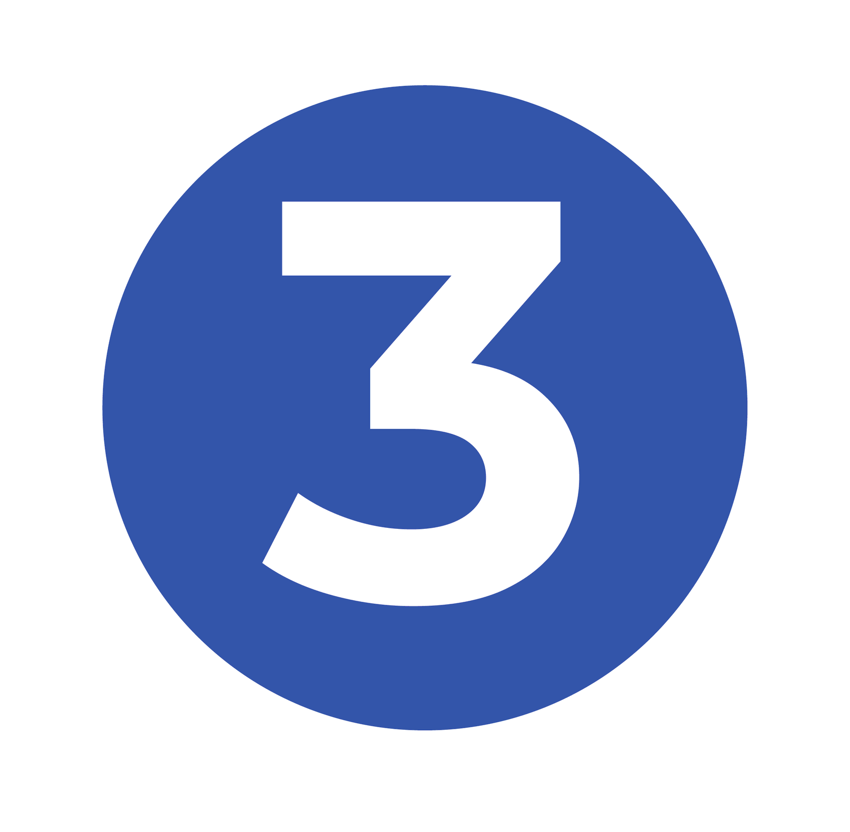
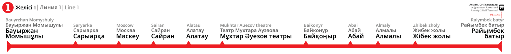
In my project, I propose replacing the letter-based designation with a numeric system. This is a significantly more universal option, understandable to everyone regardless of language:


3. To the Trains
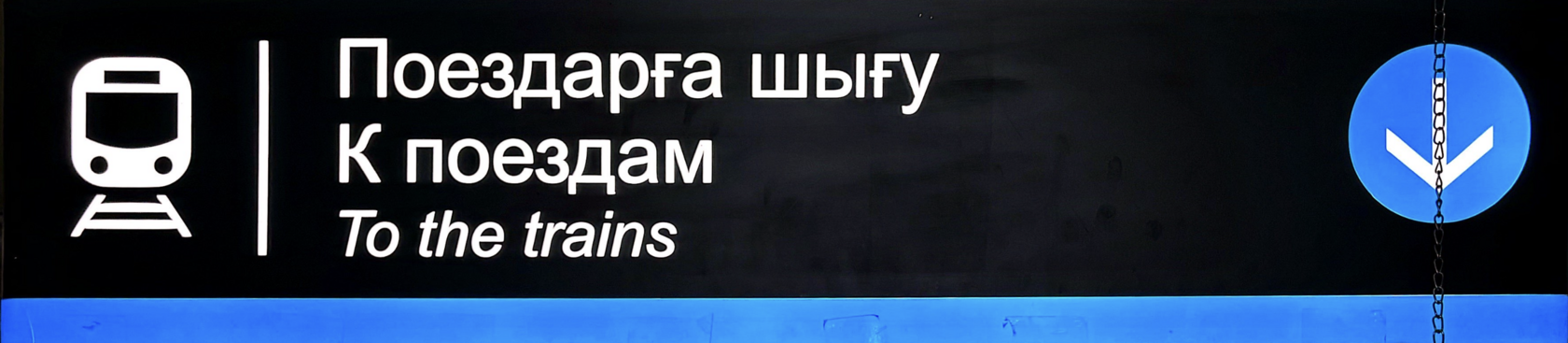
Let's get back to the metro entrance. After seeing the logo in the underpass you're usually greeted by the sign "to the trains"
This example reveals that the current navigation style is rather grim. The predominance of black and the overall arrangement of symbols create an unwelcoming image of the underground.
Moving beyond aesthetics, one immediately notices an arrow pointing in the wrong direction. Standard practice dictates that the forward direction is indicated by an arrow pointing upward. In this case, however, the arrow points backward.
It's also unclear why the color blue is used here. When there is more than one line, this kind of color coding will only cause confusion. One might think this sign directs passengers to trains on a blue line.
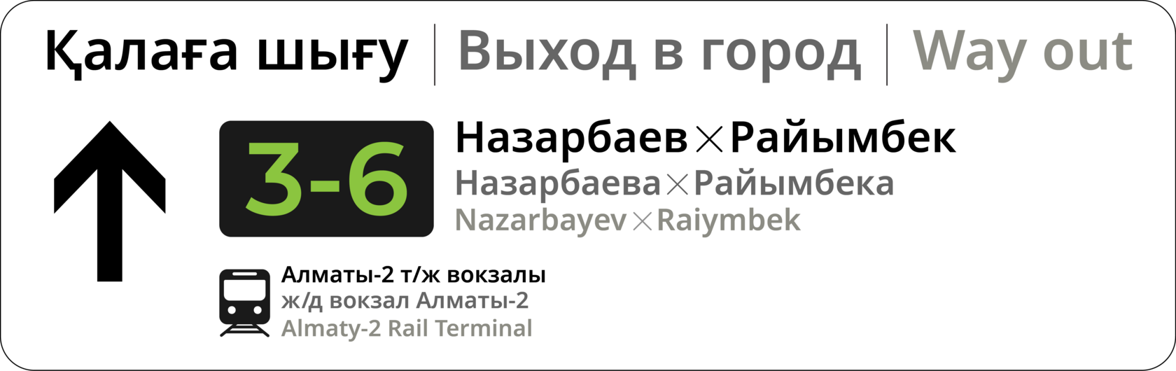
After analyzing and redesigning this sign, I arrived at the following solution:
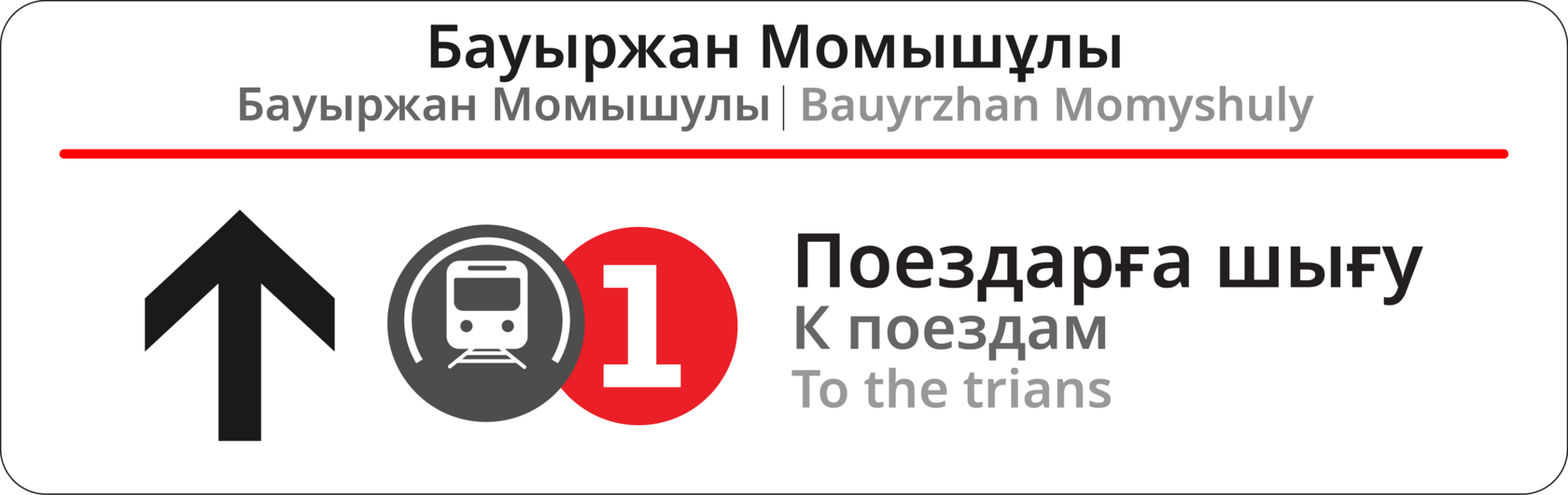
The sign has become brighter and more contemporary. The arrow finally points in the correct direction.
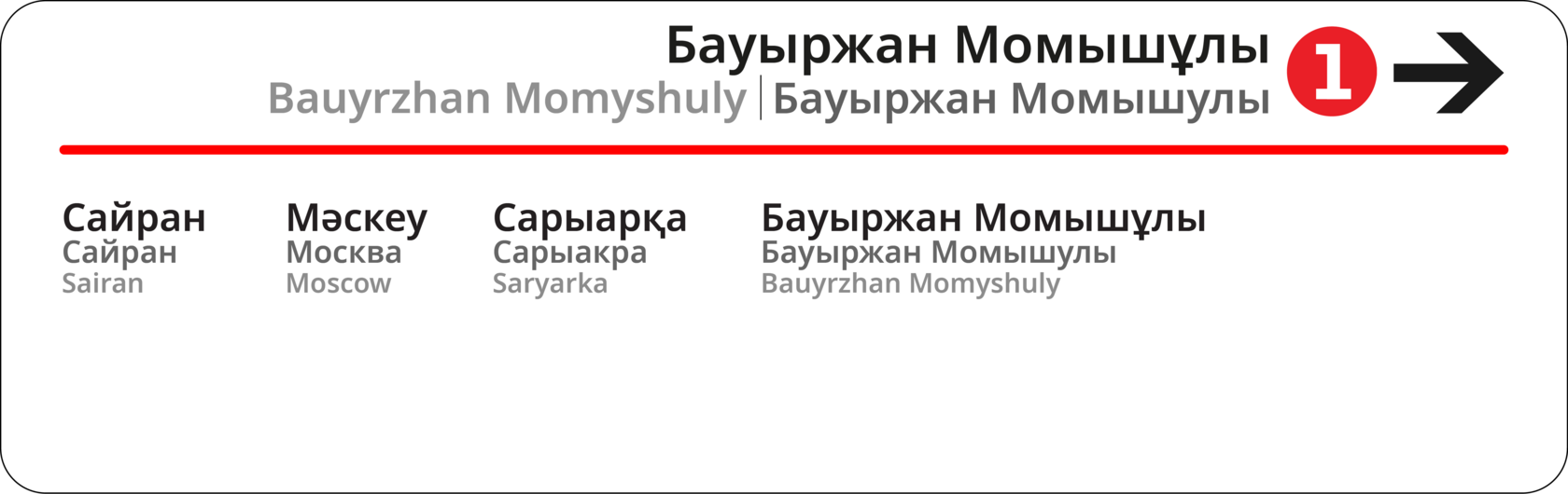
The station name is featured at the top in three languages.
Each language is assigned its own color shade.
The station name is featured at the top in three languages.
Each language is assigned its own color shade.
- Kazakh, as the primary language, is the largest and most saturated.
- Next is Russian, slightly less saturated and a bit smaller in size.
- Third is English, using the lightest shade.
- This principle of color-coding languages will be applied throughout the whole navigation system.
- The main section now features the line number. The divider is also painted in the line's color.
4. Direction
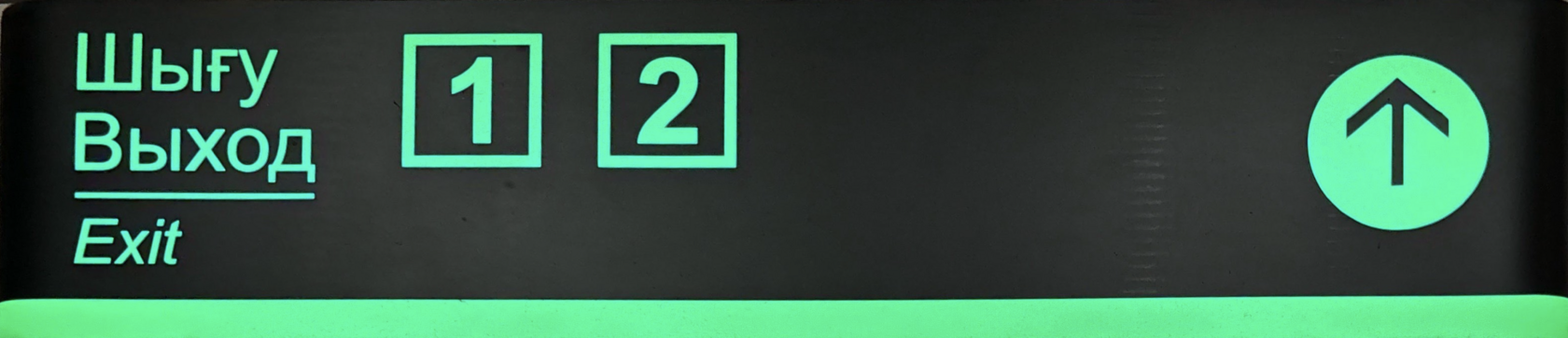
Once we enter the metro, the next step is finding the correct platform side for your direction. In the current system, this function is served by these signs:
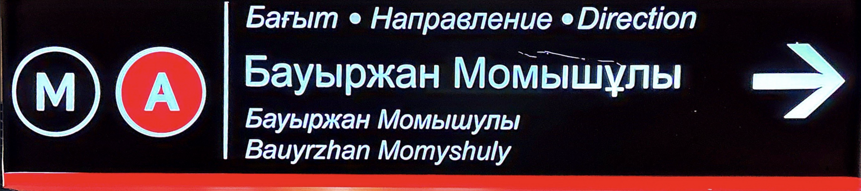
Its problem is that it only indicates the final station towards which the train is heading. However, not everyone has the metro map memorized and can figure out which side leads to their station.
Furthermore, unnecessary icons once again take up too much space.
Furthermore, unnecessary icons once again take up too much space.
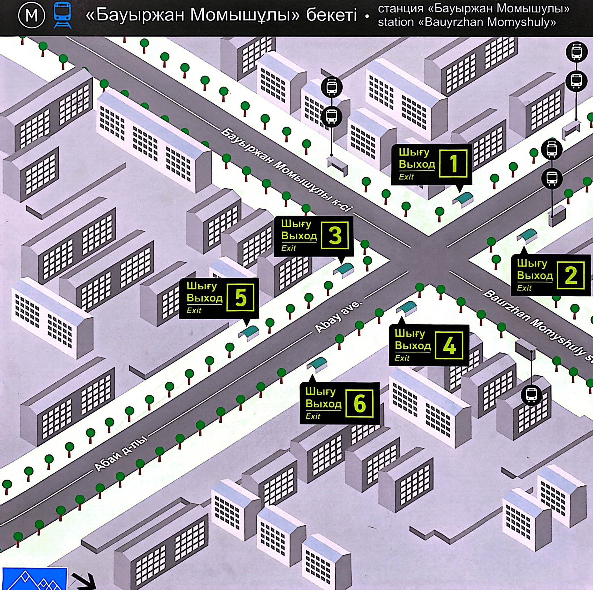
The new version is also brighter and therefore easier to understand than the current one. Thanks to the proper arrangement of elements, all the train's stops now fit on a single placard. A specific sign is created for each station. Above is the sign for the "Bauyrzhan Momyshuly" station.
This pair of signs is for the "Alatau" station. As you can see, the diagram only shows the stations the train will pass through.
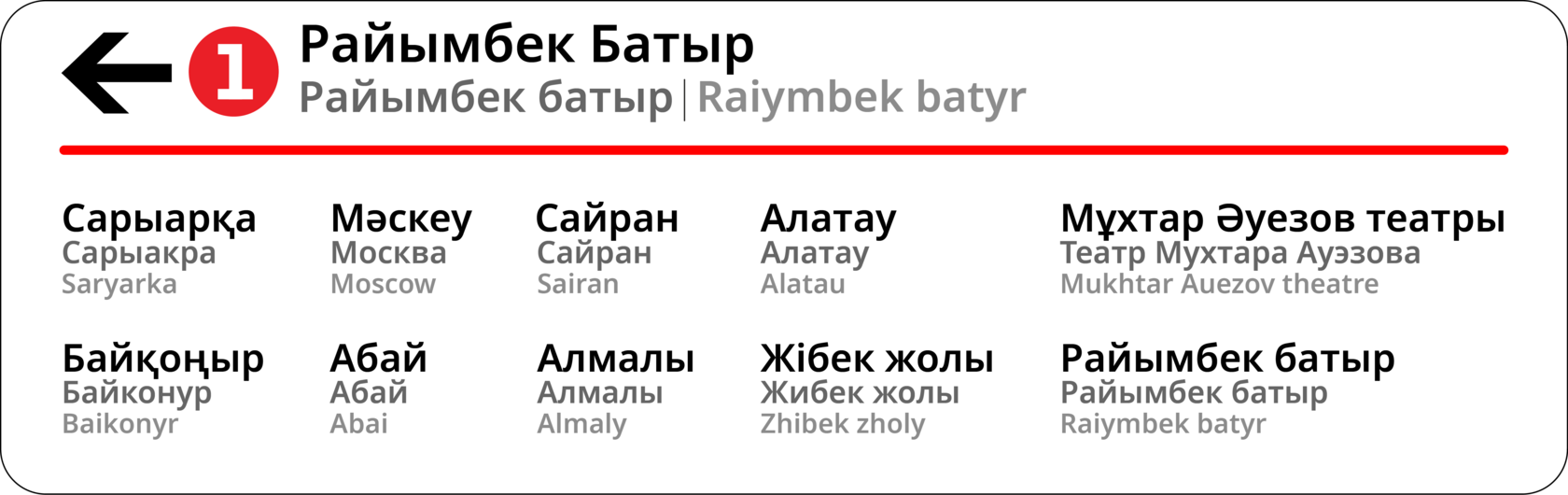
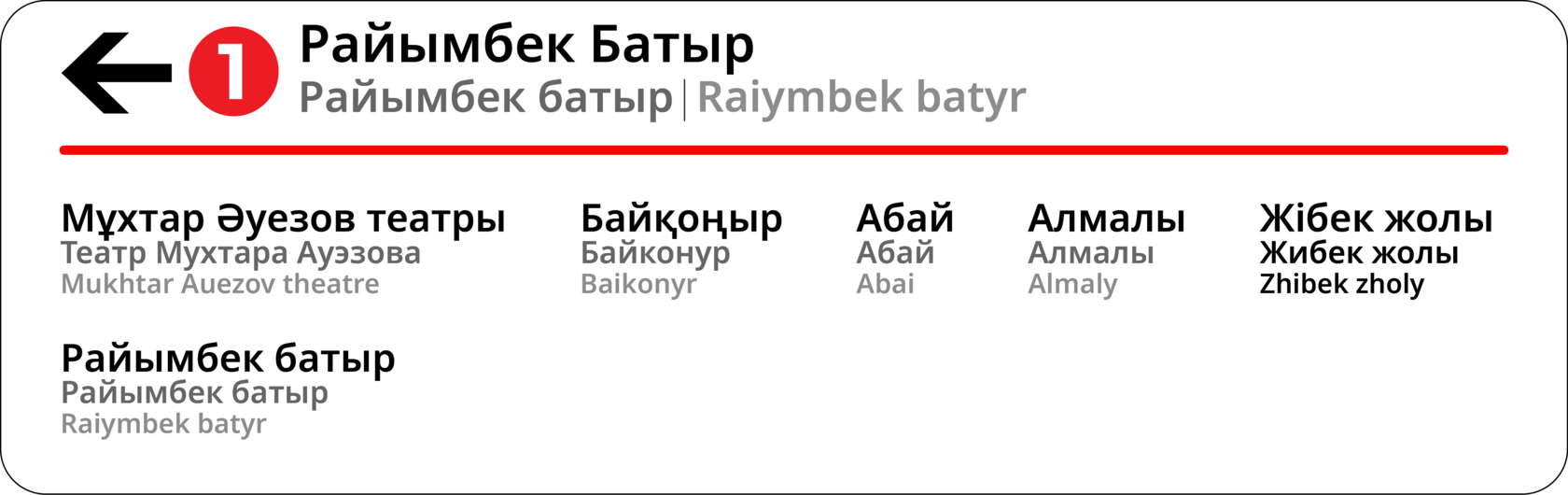
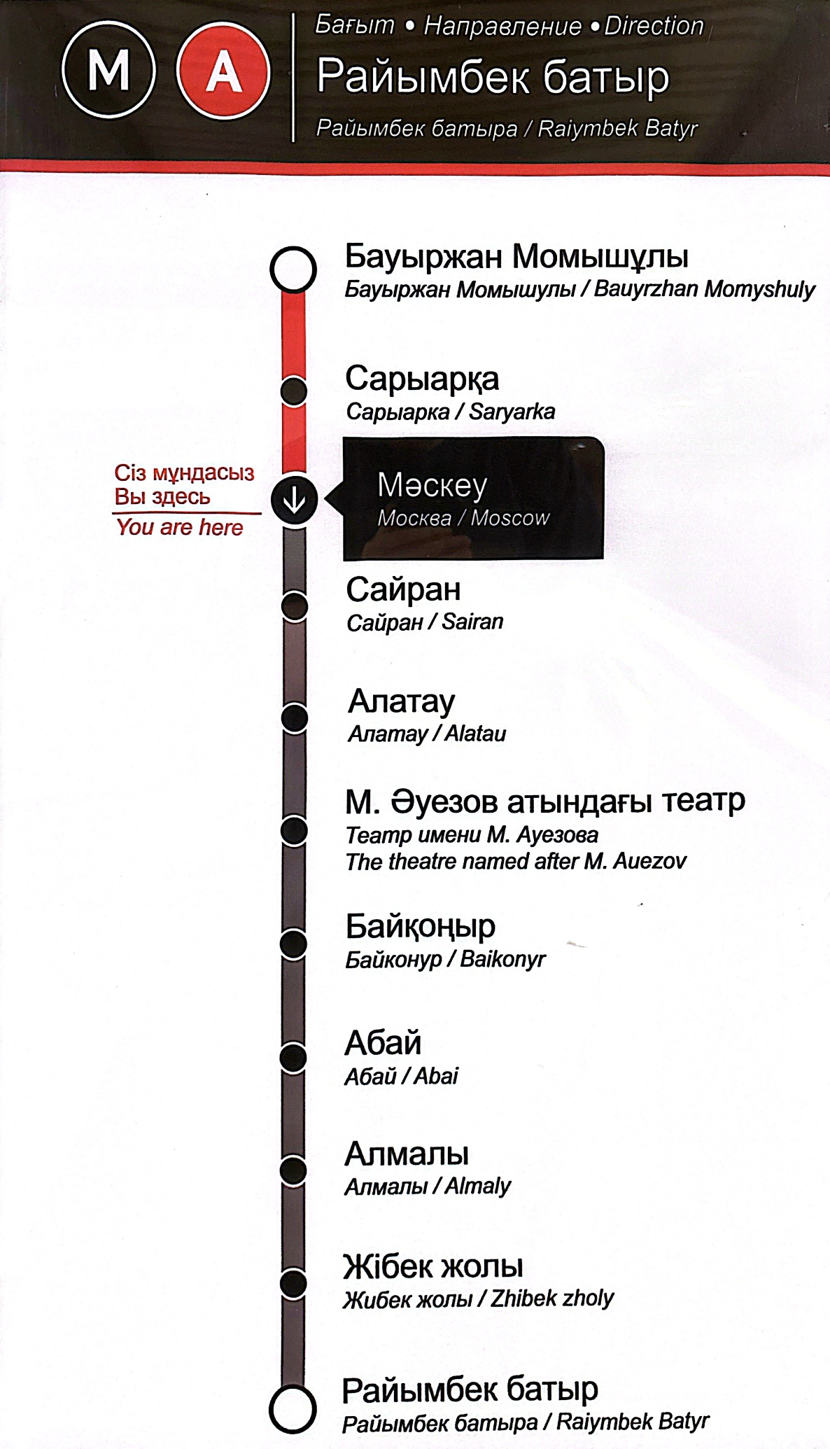
Additionally, vertical route maps assist in determining direction.
In its current form, it looks like this:
In its current form, it looks like this:
- It's unclear why so much space on the left is wasted for the inscription "You are here," especially since the passenger's current station is already highlighted in color. The purpose of such diagrams is to allow passengers to quickly orient themselves and understand which way to go. This diagram fails entirely in that regard.
- There is no point in displaying stations the train has already passed. It only creates clutter. If you remove the faint arrow, it becomes completely unclear in which direction the train is traveling.
As with the overhead directional signs, the vertical route map uses the same principle: it only displays stations the train has not yet passed. The station where the passenger is located is highlighted using the line color.
You'll also notice the new line design here. The old gray dots were dull. New "peak-shaped" markers do a much better job of pointing to the station name, add a bit of unique flair.
Near the "Raiymbek Batyr" station, there is a notation for the Almaty-2 railway station, as it is an 8-minute walk away. It's important to show this so passengers know they can conveniently reach the train station by metro.
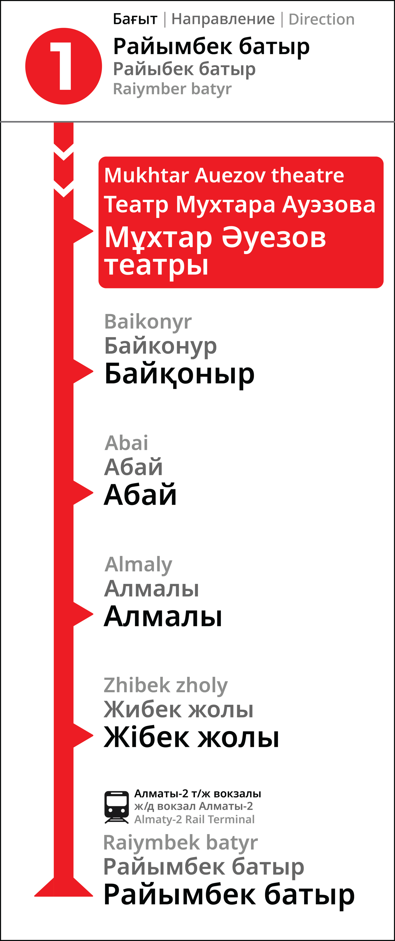
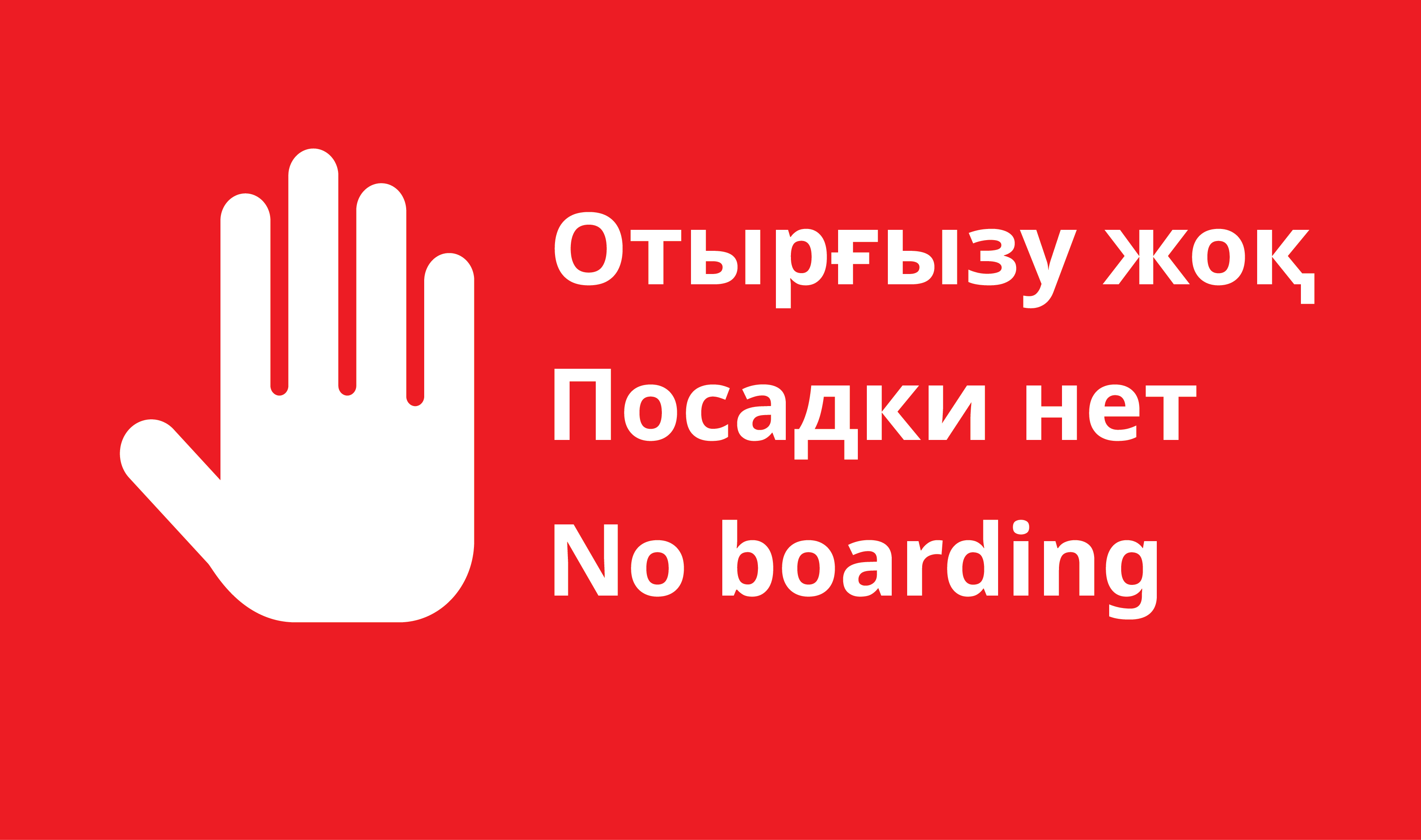
For terminal stations, where on one of the tracks the train unloads all passengers and departs for the turnaround siding, the following indicators have been developed:

These replace the standard vertical and overhead signs when boarding is not possible. In this specific situation, red is unrelated to the line color. It attracts attention and sends a strong "do not enter" message.
Overhead sign replaacement
vertical route map replacement
5. Line Map
Inside the train car, we encounter the above-door line map. It helps us avoid missing our stop and shows how many stations are left. Let's look at the current version:
One-third of the map is taken up by the "M" and "A" circles. These designations aren't important enough to deserve that much prime space.
The actual line is squeezed into the remaining narrow area. This forced the station names to be written at a diagonal — not the most intuitive approach, as people don't typically read text on a slant.
To be fair to the original designer, this technique exists and is sometimes used in transit maps, but usually only when no other layout is possible. Here, with only 11 stations, they could easily have been arranged in the conventional way.
- The new map looks much more open. It no longer feels squeezed or cluttered. Text is now horizontal, making it much easier to read.
- The line icon remains but is smaller.
- The map uses three languages. This demonstrates the unity of the entire navigation system, whereas in the current system, one of the languages often gets lost.
- The "Raiymbek Batyr" station, just like on the vertical map, features a railway station icon, and now also indicates that it's an 8-minute walk away.
6. Выход в город
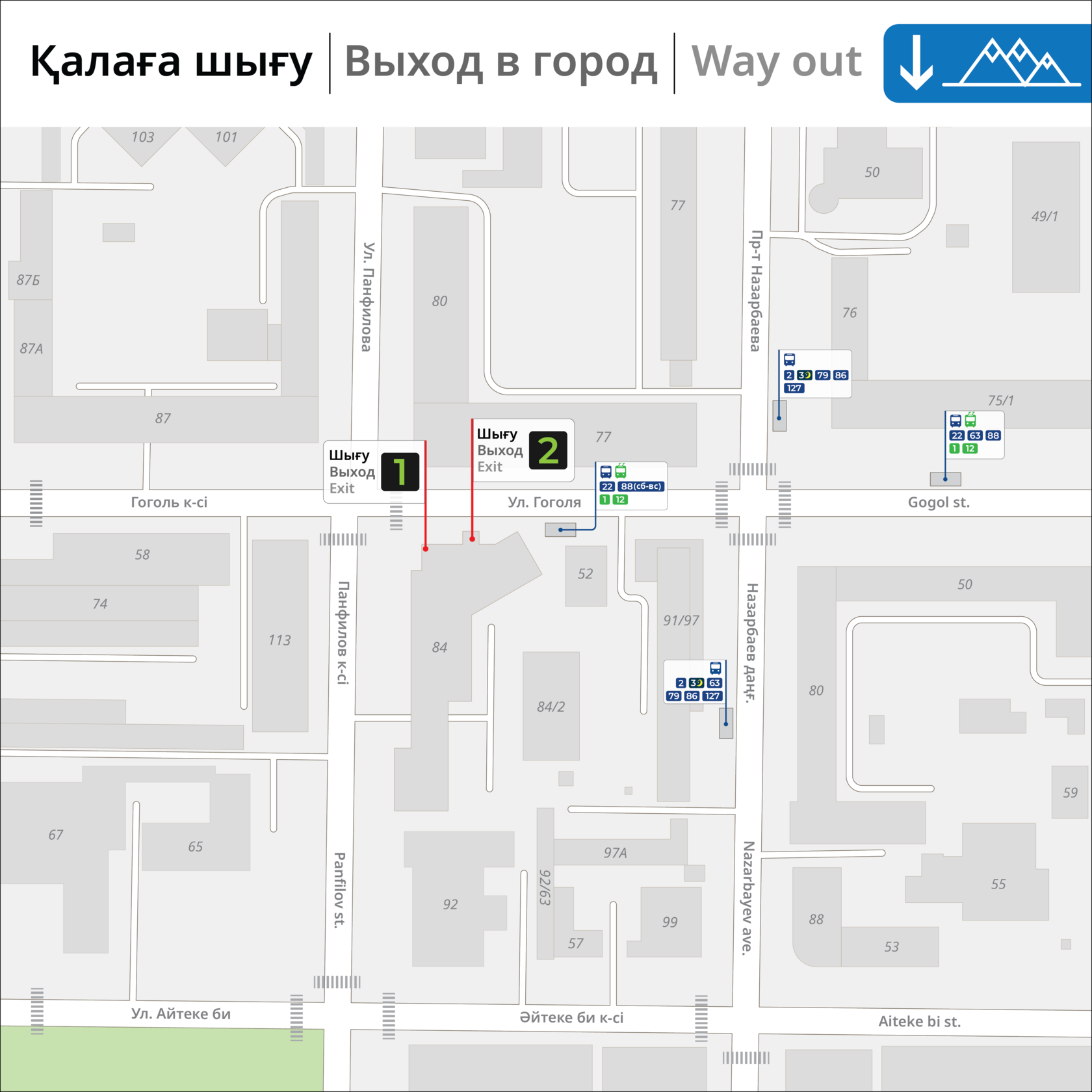
When exiting the train, we need to find the right way out. This is a very common problem, and just the exit numbers are usually not enough. After all, there's no way to know where an exit actually leads, especially for a first-time visitor. This problem is compounded by the fact there is no internet access in the metro and underground passages. You can only tell if you've exited correctly once you're outside.
Surprisingly, on this diagram, the arrow points in the correct direction.
New version shows the streets and key landmarks each metro exit leads to. The "X" icon indicates a street intersection.
Additionally, some stations feature "3D" exit maps:
The concept sounds good, but the execution isn't very practical. Buildings are often too slipmlistic and bear little resemblance to reality. Bus stops are marked, but it seems pointless without listing the routes.
The new map is done from a top-down perspective. It marks the real shape of every building, down to the tiniest alley.
The bus stop markings now have a purpose. With this map, you can easily see which bus or trolleybus routes stop at each location.
The bus stop markings now have a purpose. With this map, you can easily see which bus or trolleybus routes stop at each location.
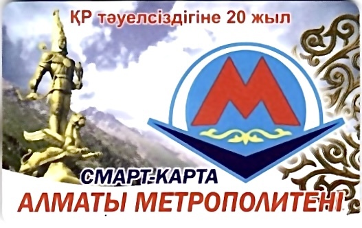
7. Travel Pass
Few people know this, but the metro has its own plastic travel cards. Their design, frankly, leaves a lot to be desired.
The design is simple and clean, just like the new navigation system. The card features city landmarks with the outline of the mountains in the background.
You don't need any text to know which city this is. With its new look, the travel card is no longer just a ticket — it's become a neat souvenir.
You don't need any text to know which city this is. With its new look, the travel card is no longer just a ticket — it's become a neat souvenir.
Their purpose is a bit unclear, since most passengers pay with cash or a regular bank card. For a travel pass, most people use "ОҢАЙ." But these cards exist, so they were included in the redesign.
8. The Main Map
Finally, the most important part. Overall metro system map.
It’s the most information-dense, and therefore has more issues than the previous examples.
It’s the most information-dense, and therefore has more issues than the previous examples.
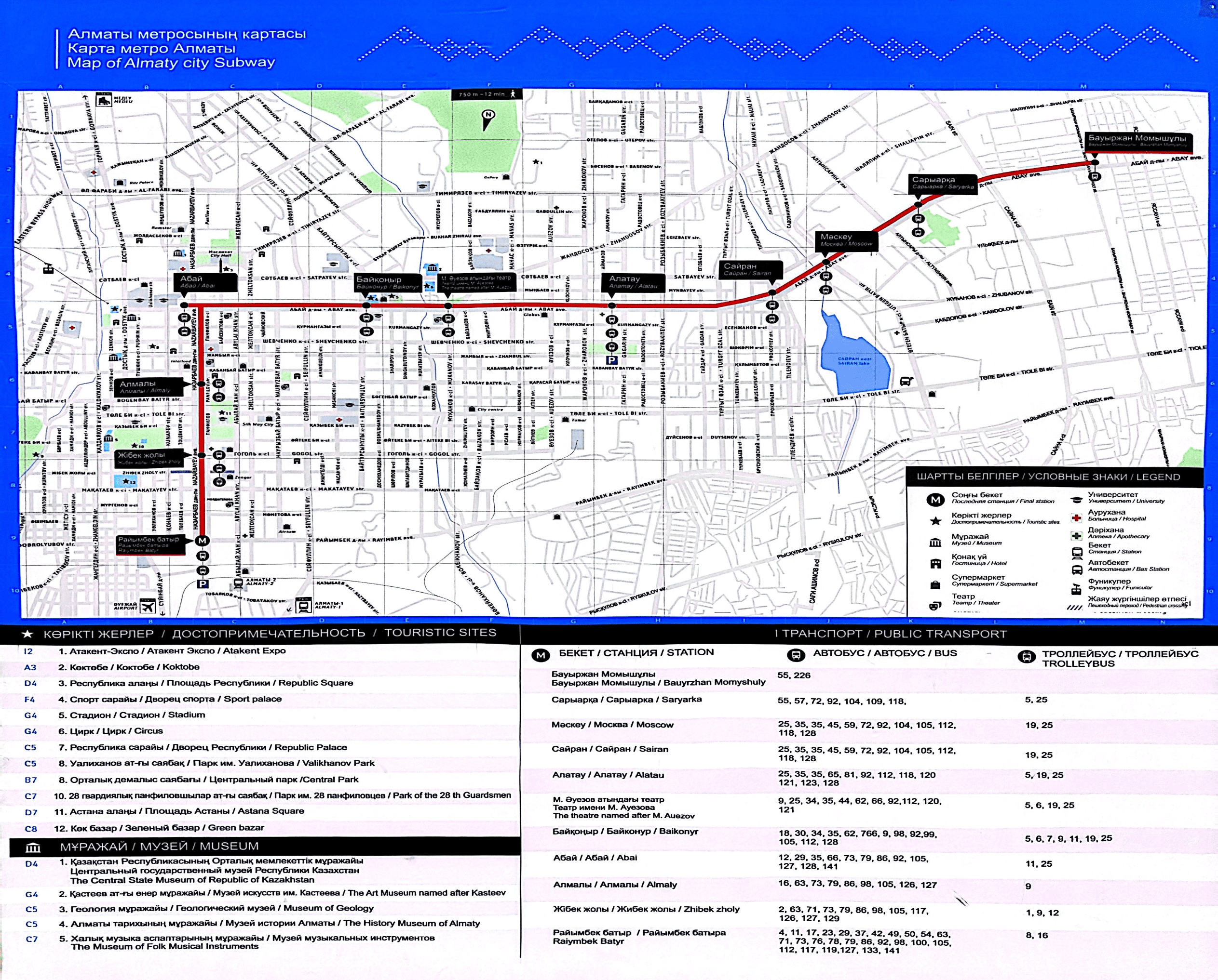
Let’s skip over the poor print quality, that’s a technical issue. To keep things clear for both of us, I’ll break it down point by point:
1. Navigation Grid.
If you're not sure what that is, it's a grid meant to help you locate objects faster. For example: *The Circus is in sector G4*. But if you try to find sector G4, you'll discover it's, first of all, not easy, and second — there's no circus there.
It's unclear why this grid is even on the map. It's messy V , cuts off in the middle, and no one uses it. We're removing it.
2. The False Fork at Abay.
The station is visually drawn separately from the main line. Usually, this indicates a branch line or a fork. Looking at this map, you might think that from *"Baikonur"* station, some trains go to *Abay* and turn back, while others continue toward *"Almaly"* station—but that's not the case.
In reality, this is a major technical error. The designer incorrectly plotted the line and accidentally drew a non-existent forkю Let's fix that.
3. Too Many Unnecessary Labels.
There's no point in marking every pharmacy, hotel, or supermarket on a metro map. These places open and close all the time. Updating the map each time just because some pharmacy recently closed is pointless. And people don't need it anyway. If someone needs a pharmacy or a hotel, they're much more likely to just exit the metro and look it up on an online map.
4. The Map Legend.
The legend is total chaos. A pile of text on the left, empty space on the right, outdated transport data. Some routes don't even exist anymore. And it's all formatted like an Excel spreadsheet.
There are many more mistakes and issues here, but I've highlighted the main ones.
Now, let's move on to the new map of the Almaty Metro.
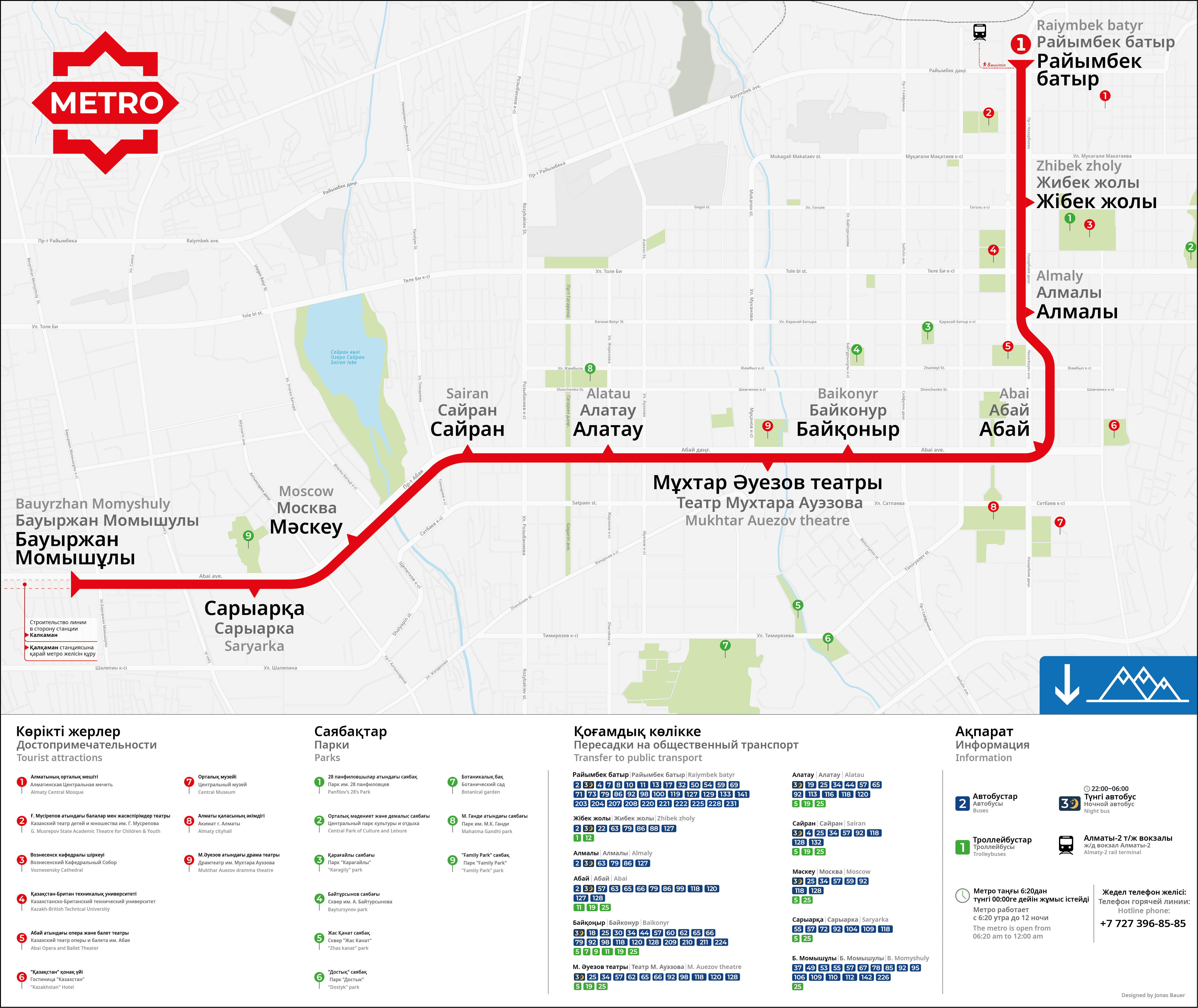
The immediate difference is its orientation. The old map famously placed south — and the mountains — at the top, which is cartographically backwards for the Northern Hemisphere. While locals might colloquially refer to going "up" towards the mountains, placing them at the top of an official map is confusing for navigation and contrary to all modern cartographic standards. Online maps, international tourists, and transit maps worldwide follow this north-up convention.
For locals who orient themselves by the mountains, a small directional icon now indicates their position.
The first section lists the city's main landmarks and parks. Each name has a corresponding number, which is also marked on the map. To make searching easier, the numbers are ordered sequentially starting from the "Raiymbek Batyr" station and continue along the metro line.
The second section shows possible transfers to above-ground public transport. The information has been updated, and each route number is designed as a distinct badge to visually separate the large array of digits. Everything is arranged in order from left to right, speeding up the search for the needed route. Previously missing night bus has now been included.
The third block is informational. It helps users understand the new map. This is where it's noted that blue icons represent buses and green icons represent trolleybuses. Other key information includes metro operating hours and the hotline number.
For locals who orient themselves by the mountains, a small directional icon now indicates their position.
- The new map uses a geo-geometric approach. I decided to keep the city map but slightly curved it so the metro line fits within a 45-degree grid. This doesn't compromise the map's accuracy, and it remains fully usable for navigation.
- Streets and avenues are labeled in three languages.
- Station names are clear and large. The "peak-shaped" markers for stations give the map a unique character.
- Past the final stop, "Bauyrzhan Momyshuly," a notice has been added about the line's future construction towards "Qalqaman" station. It's a minor touch, but it shows passengers the system is growing and actively expanding.
- The map legend has also been completely overhauled. It is now divided into three sections: "Landmarks & Parks," "Public Transport," and "Information."
The first section lists the city's main landmarks and parks. Each name has a corresponding number, which is also marked on the map. To make searching easier, the numbers are ordered sequentially starting from the "Raiymbek Batyr" station and continue along the metro line.
The second section shows possible transfers to above-ground public transport. The information has been updated, and each route number is designed as a distinct badge to visually separate the large array of digits. Everything is arranged in order from left to right, speeding up the search for the needed route. Previously missing night bus has now been included.
The third block is informational. It helps users understand the new map. This is where it's noted that blue icons represent buses and green icons represent trolleybuses. Other key information includes metro operating hours and the hotline number.
В завершении хочу выразить благодарность всем, кто помогал мне в реализации этого проекта:
English signage: Maksat, Thomas Lisovski
Kazakh signage: Snow Leopard, folks from Almaty bike community
Website translation: Paul Hopson

